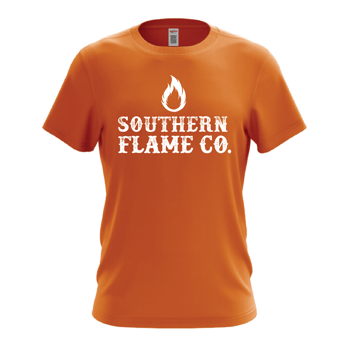
Southern Flame Co. T-shirt
This logo was designed for the client’s pyrography (wood burning) business, and employs a rustic, western font to convey a sense of rural charm. The flame symbol on the orange shirt give the viewer a small insight into the service the company offers.
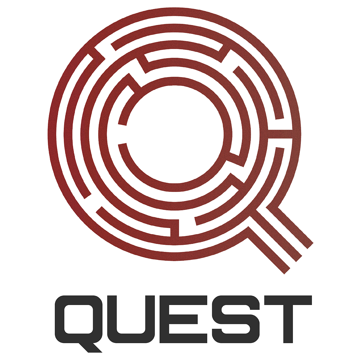
Quest Logo
Designed for a 5th and 6th grade children’s ministry, this logo features a Q -shaped maze. The maze reflects the search for something deeper, while the dark reds and grays show the serious tone of the quest.
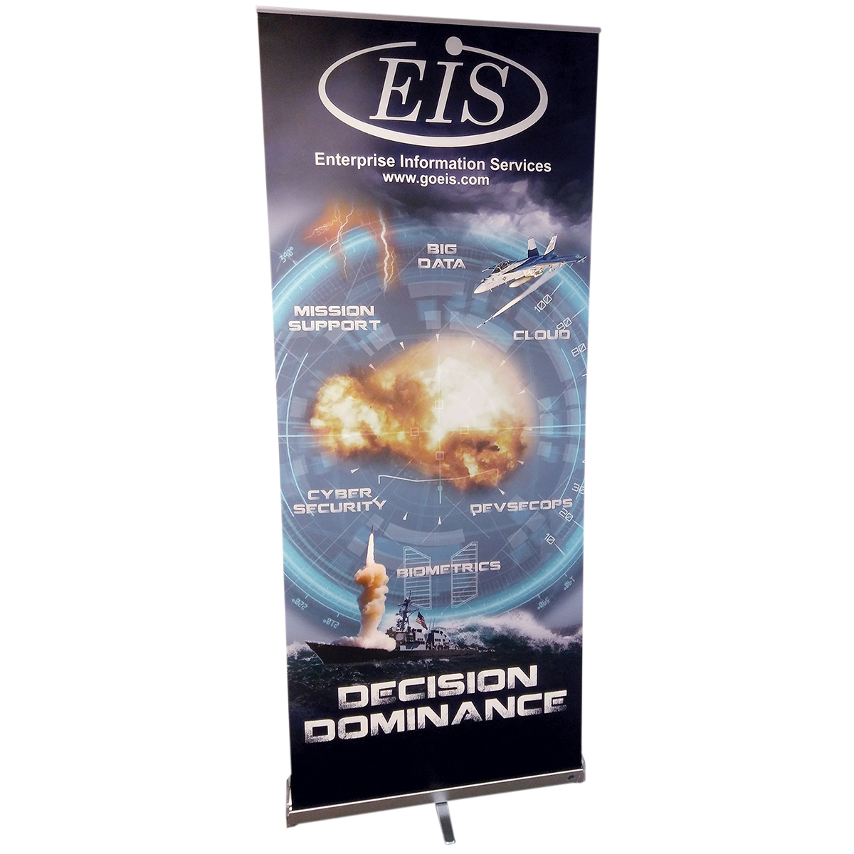
DoD Banner
This banner was created as a backdrop for a DoD trade show. The client’s directive was to “make it look like a video game.” Bold, complementary colors were chosen to give the piece a striking appearance. A bold, grungy font was chosen for the buzzwords and “Decision Dominance” subtitle to increase this effect.
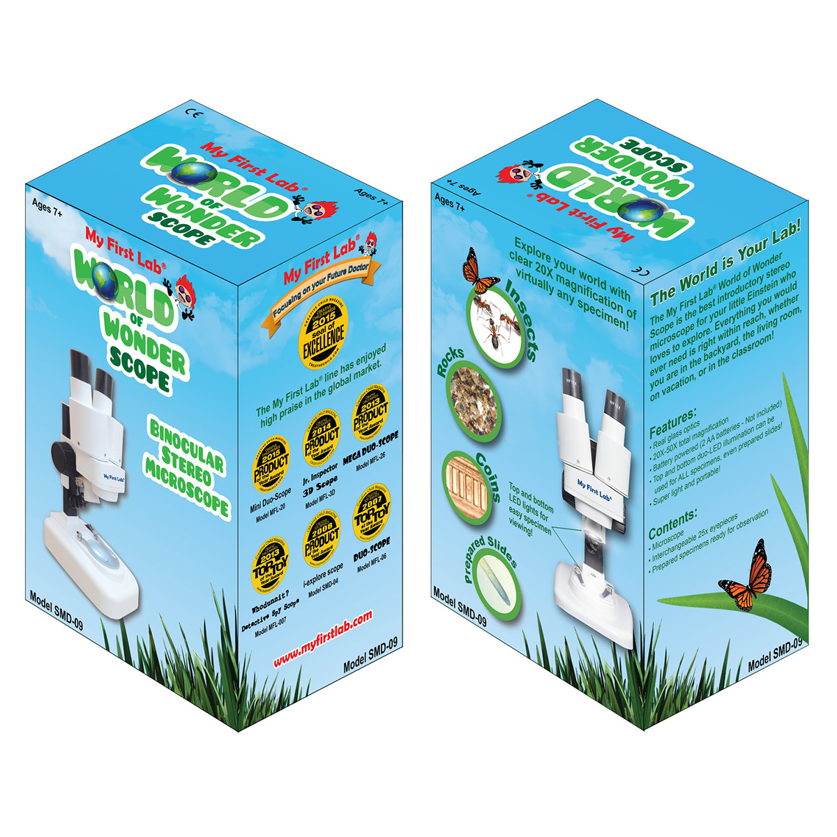
World of Wonder Microscope Box
This box, developed under the kid-friendly My First Lab brand, is designed to show all the exciting things the viewer can see through the microscope. Close up images of grass, insects, coins, and rocks show just a few examples of the exciting microscopic world they can enjoy. Meanwhile, the side panel displays the many awards won by the company.
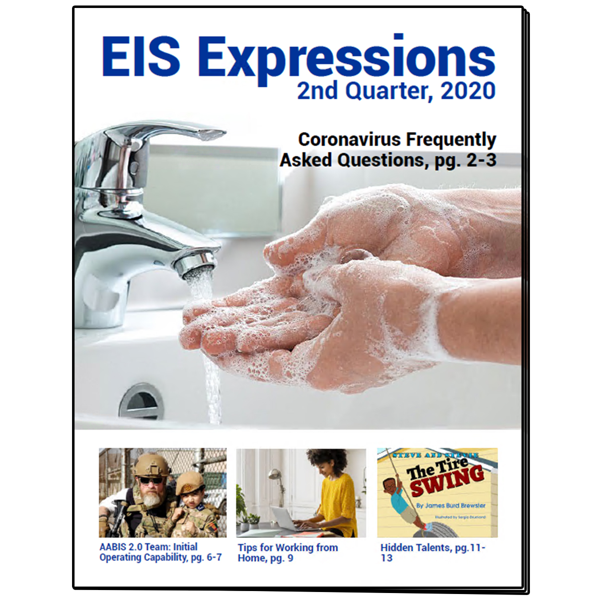
EIS Expressions Cover
The cover page for the EIS quarterly newsletter features a large, bright cover image and a bold title. The subtitles and individual images give the reader a preview of some of the feature stories of the issue, including interactive links to each page (in the PDF version).
The Call Logo
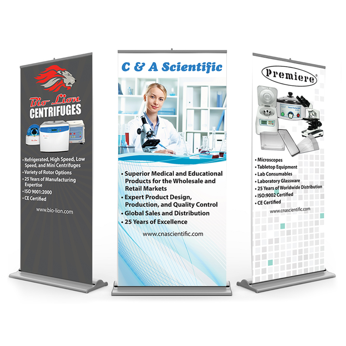
C&A Tradeshow Banners
These banners were designed as a set to be used for a tradeshow backdrop. The central banner showcases the company and its products, while the left and right banners display the company’s two main product lines. All three have a unifying color palette of whites, grays, and blues, combined with futuristic backgrounds for a cohesive feel.
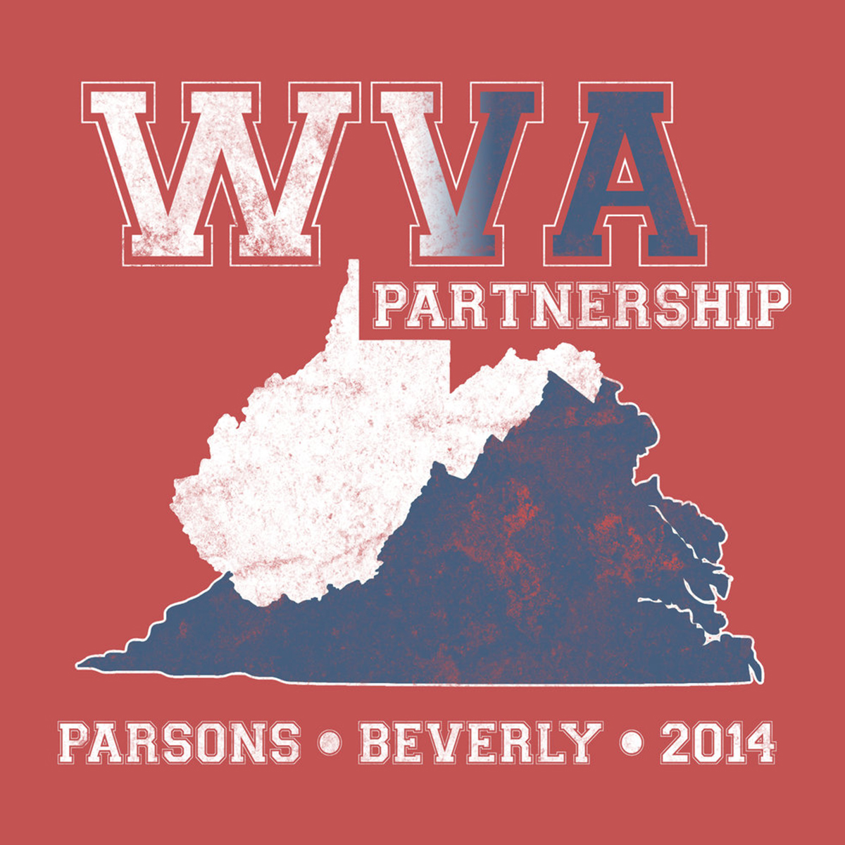
WVA Partnership T-shirt
This t-shirt design features a collegiate font and weathered textures reminiscent of popular clothing brands. The use of white and blue joins the two states in partnership, and the addition of the red t-shirt as a background unites people from both states as Americans.
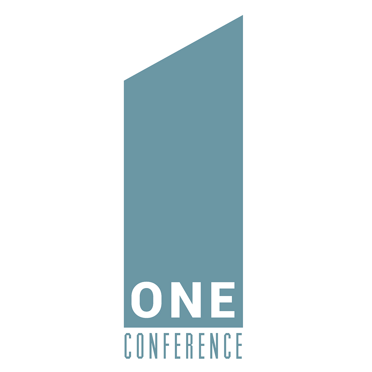
One Conference Logo
This conference logo centers around a central idea of the number one. The clean, focused appearance, with the use of modern fonts and a monochrome palette, show unification in both the theme and the content of this conference.
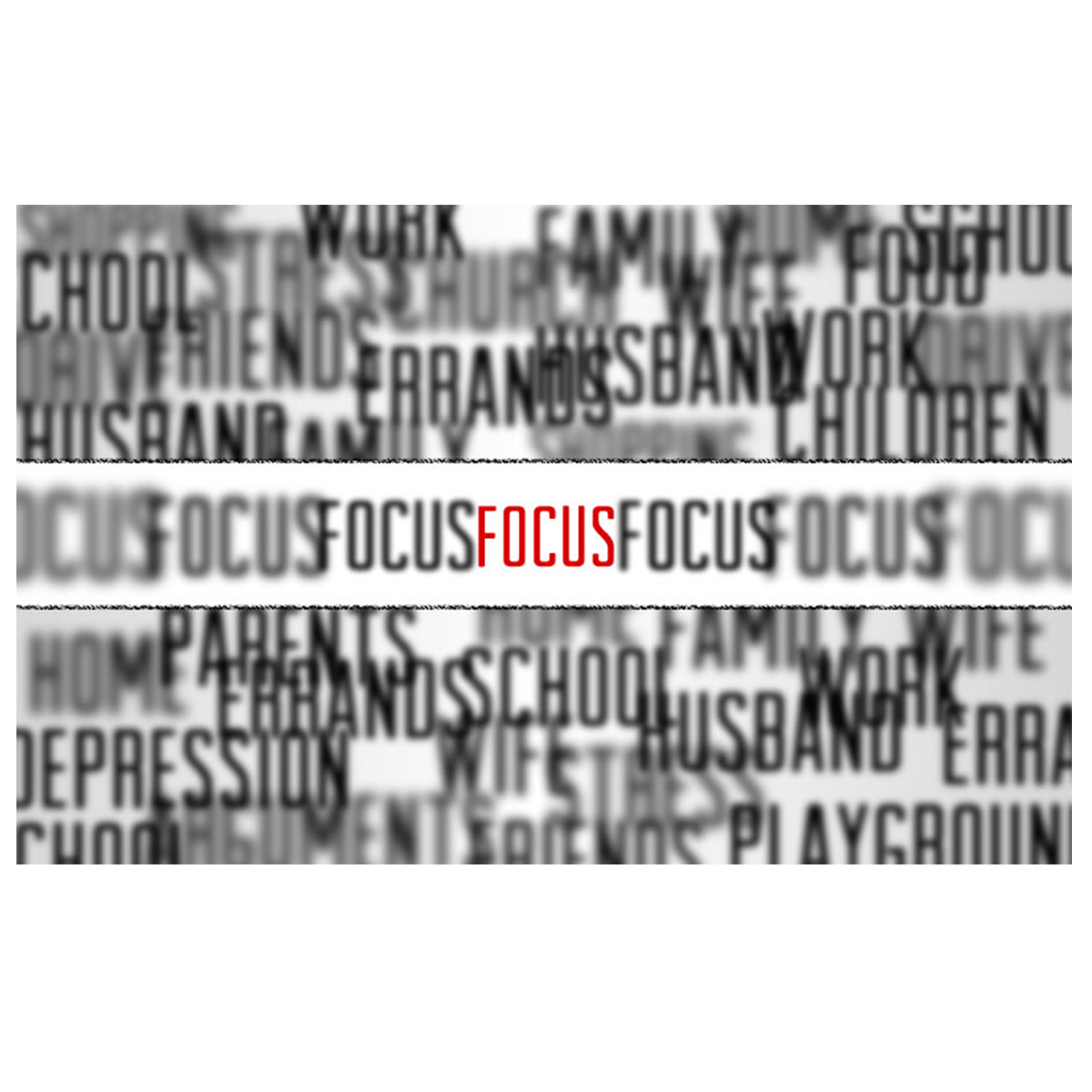
Focus Advertisement
This ad image for a lecture series utilizes a vivid contrast of colors to grab the viewer’s attention. The use of blurred words around the outside of the central image attempt to distract the viewer, but the singular, central word both in red and in focus inevitably draws the viewer back to what’s important at the center.
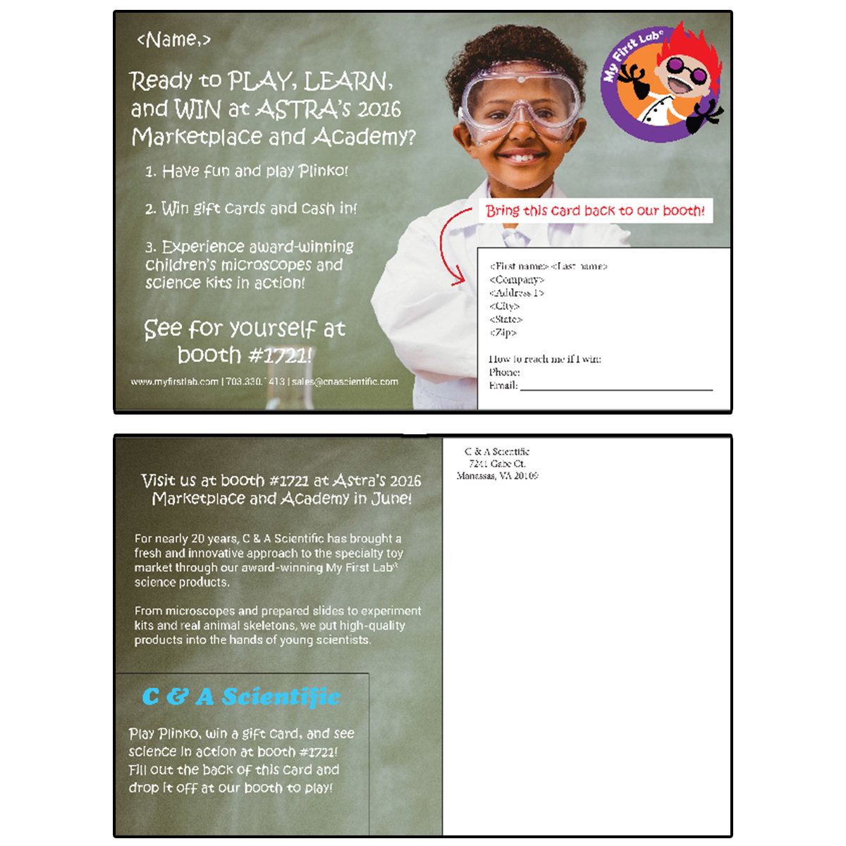
ASTRA Postcard Mailer
With a fun, playful attitude in mind, this mailer was designed to entice tradeshow-goers to visit the company’s booth. The My First Lab logo plus the child scientist and chalkboard convey the light-hearted tone of the piece, furthered by the child-like chalk handwriting.
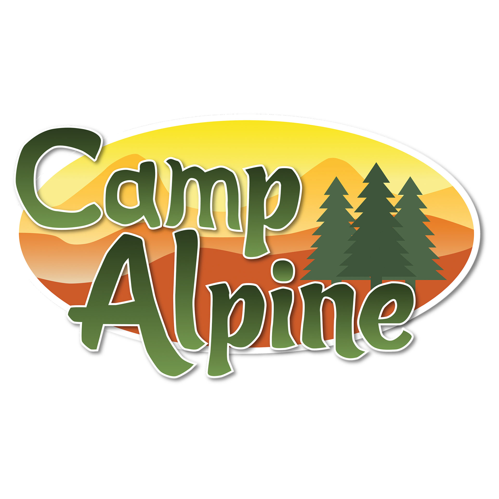
Camp Alpine Logo
This logo for a fictional camp was designed to draw the viewer in with peaceful sunset and evergreen forest imagery. The warm background colors, combined with the rich greens, create an inviting, natural atmosphere. Meanwhile, the custom vector font gives the logo a fun, playful feel.