Meeto: Conference Room Finder
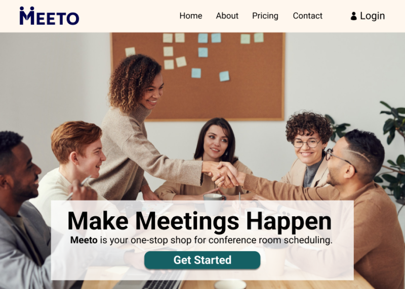
Try out the interactive demos here:
Overview
Meeto is a conference room finder for companies looking to streamline their conference room booking process for employees. It helps employees:
• Find available rooms
• Compare room features
• Book a room immediately
• Schedule future or recurring meetings
The Problem: A Scheduling Nightmare
Scheduling a meeting where all the required coworkers can meet at the same time and place can be a nightmare. Most companies have no easy way to coordinate such complicated requirements. I set out to design an app to help employees book conference rooms quickly and easily within their companies.
Scope and Constraints
I completed this project solo, and worked within a deadline of 8 weeks.
Task Flows
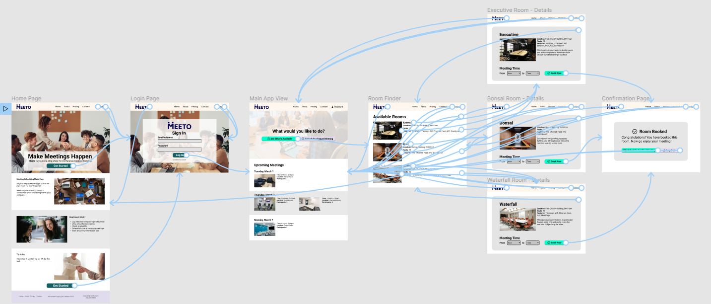
I created a task flow diagram in Figma detailing the steps a user would take for a given task. I learned the value of starting with a task flow as a foundation on which to build each of the preceding steps.

Wireframes
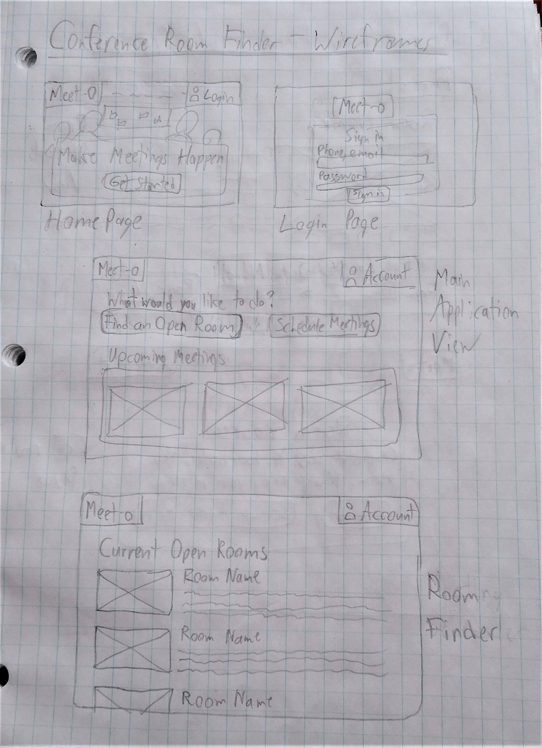
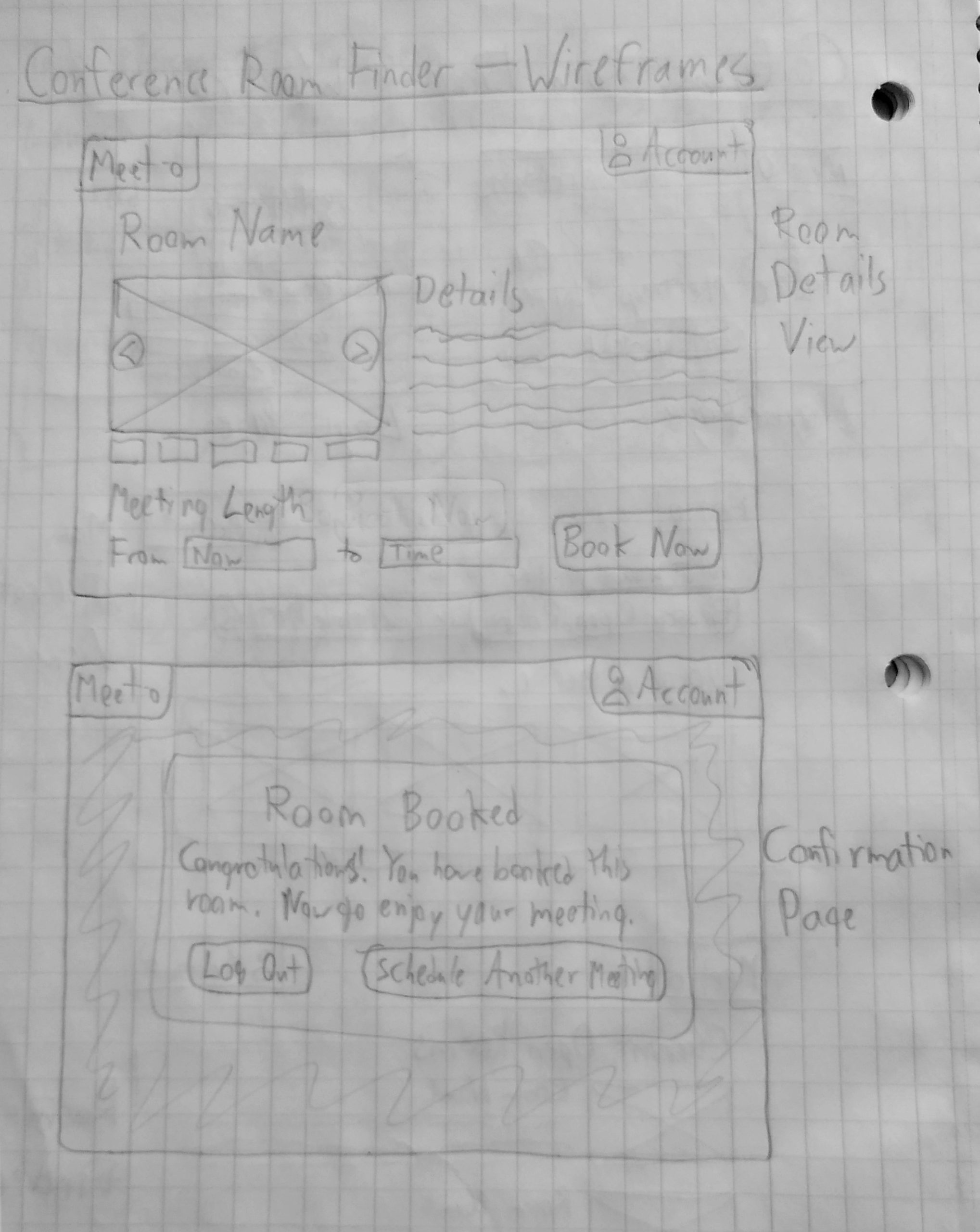
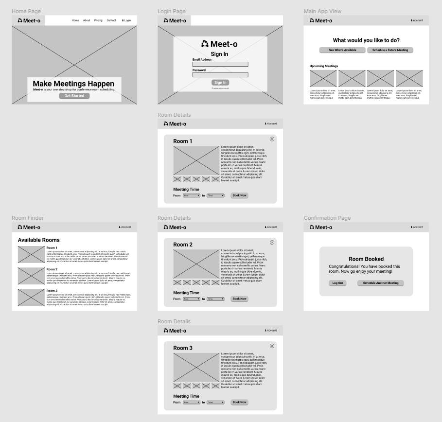
I then made sketches of my screens on paper, followed by digital wireframes. I focused on creating simple, clean designs that drove the user toward a single action on each screen.
Logo Design
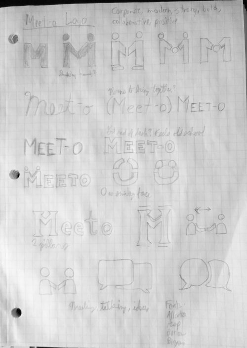
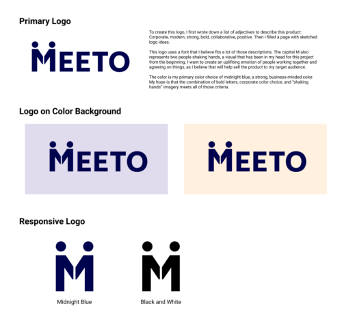
I drafted up a series of ideas for a product logo on paper, followed by some digital mockups. I started by brainstorming words to describe my logo, then began sketching ideas to fit that list. I wanted something modern and bold, but something that fostered collaboration and positivity to capture all that conference rooms can represent.
Style Guide
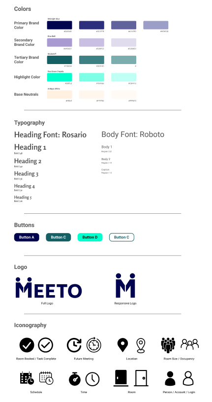
I built a style guide containing all my style decisions for how I wanted the final product to look. This included color choices, typography, buttons, logos, and icons.
I started with Midnight Blue as a strong, corporate color, then built out the rest of my hues around that. I chose fonts that were modern, but with a little bit of traditional character as well. Finally, I chose icons with matching styles to fit the clean, modern look of the application.
Hi-Fi Mockups
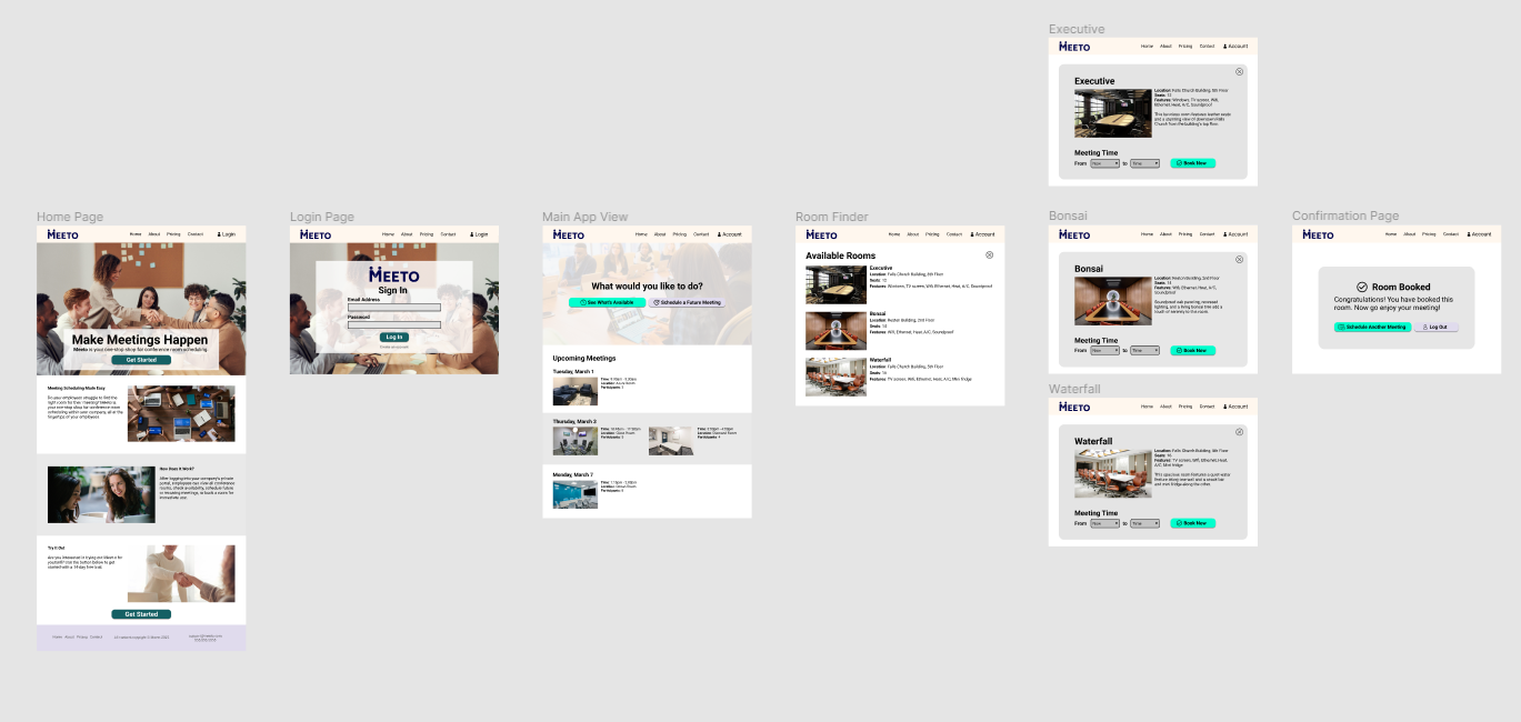
I used my previous wireframes to develop high fidelity desktop mockups, including my colors, buttons, imagery, logo, and icons. I also programmed a clickable prototype version, ensuring that the user could navigate through the chosen task flow and repeat it as needed.
I then did some basic testing with friends, gathered feedback, and incorporated it into revisions of the design.
Mobile Mockups
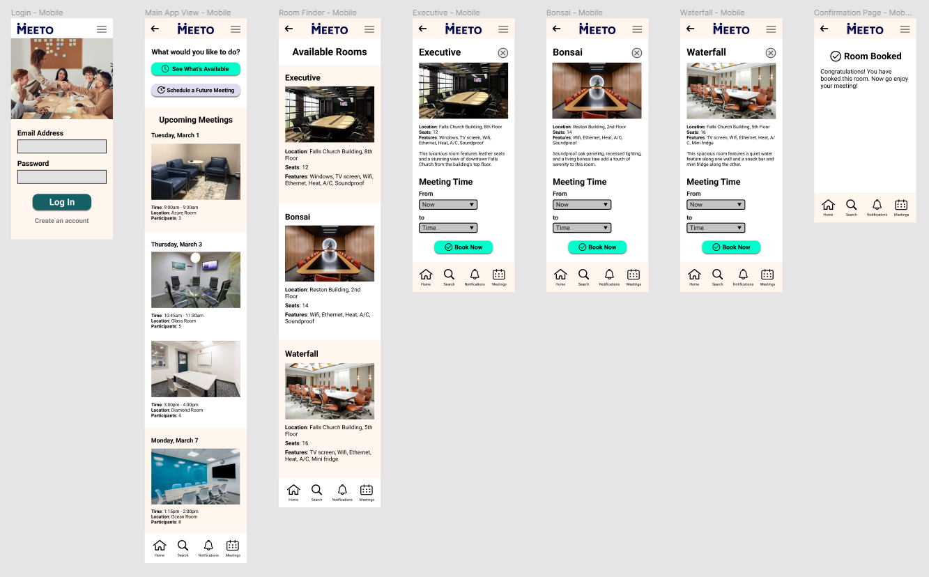
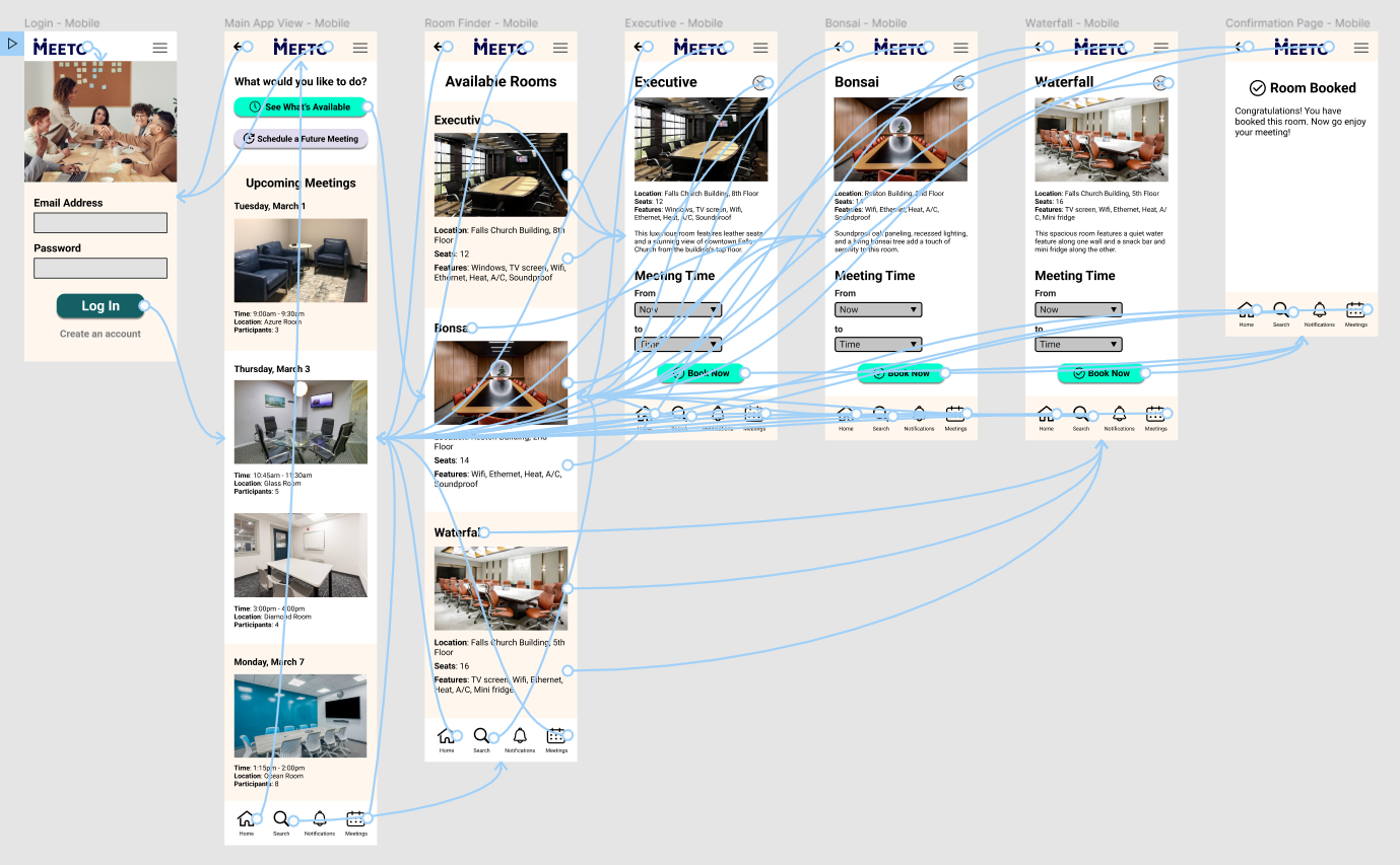
I developed mobile mockups for an app that employees could use in the same way as the desktop website. This version features an equally clean layout, matching aesthetics, and intuitive functionality. I turned this into an interactive prototype as well.
Handoff
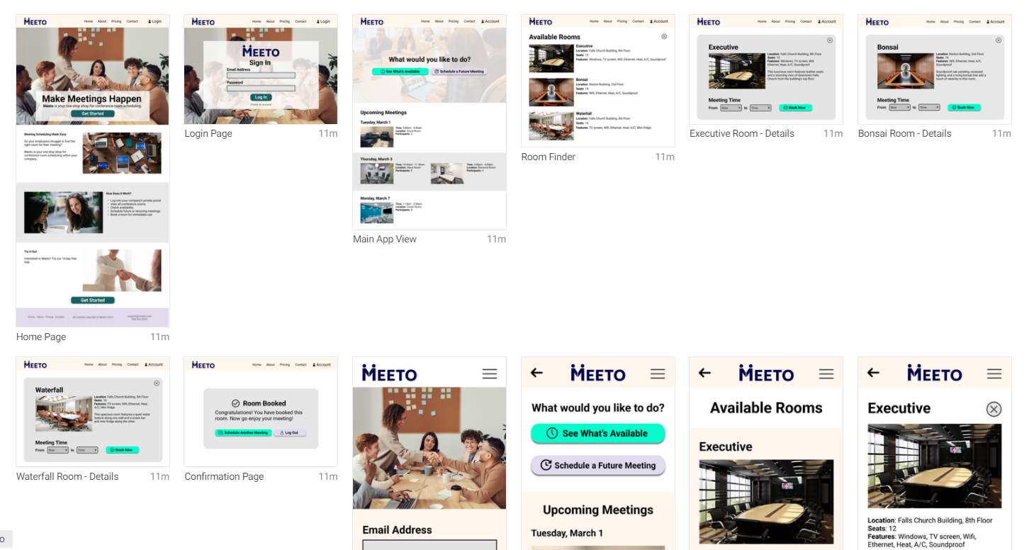
Finally, I packaged up all my design files with InVision and prepared them to hand off to a developer.
Lessons Learned
Through this course I learned:
- The strategic importance of building this process step-by-step. Each part of the design builds on the one previous.
- How to incorporate each part of the design into a final product.
- How to get user feedback and apply it to the design to improve its functionality.
Try out the interactive demos here: