Sous Chef: The All-in-One Cooking App
Overview
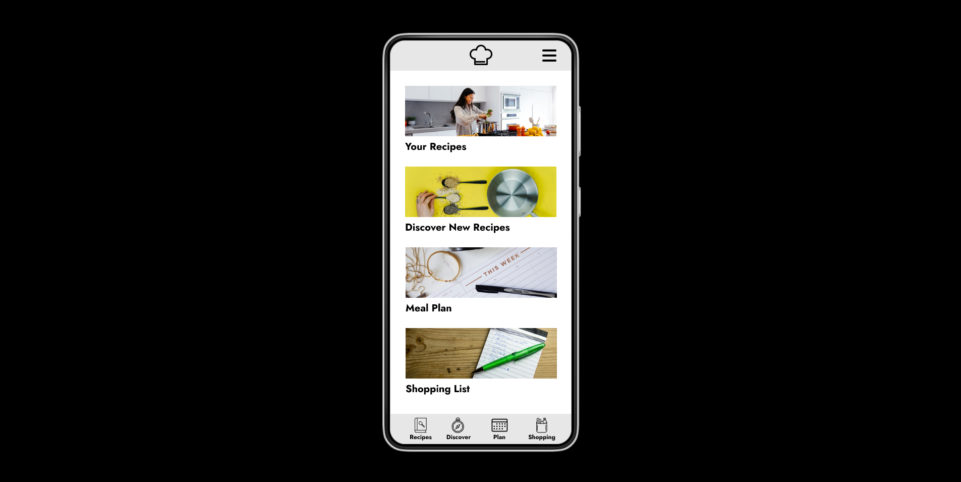
Sous Chef is an all-in-one cooking app geared toward busy adults who cook for their families. It helps users:
- Discover new recipes,
- Organize their favorite recipes,
- Plan meals for the week,
- Shop for ingredients, and
- Cook their meals all in one place.
The Problem: No One App
While many cooking apps exist on the market, they all seem to do only one or two things well. None of them handle the entire meal planning, shopping, and cooking process from start to finish.
Users could use multiple apps, but switching back and forth between apps–not to mention transferring recipes and ingredients between them–is a pain. And if the user also uses physical cookbooks, keeping them organized with digital recipes is nearly impossible.
Scope and Constraints: One Month, One Person
I gave myself a deadline of one month to complete this project. I knew the all-in-one app concept was rather ambitious, so a good deal of time would be spent in the wireframe and prototype design stages. Completing all the roles myself added additional constraints.
Market Research: No All-in-One Solution
While there are plenty of cooking apps out there, they all seem to do only one or two things well. No app seems to exist on the market that incorporates all the features of an excellent all-in-one recipe and cooking app: Recipe discovery, recipe collection, meal planning, shopping list builder, and cooking aid.





Questions and Assumptions: Does My Audience Need This?
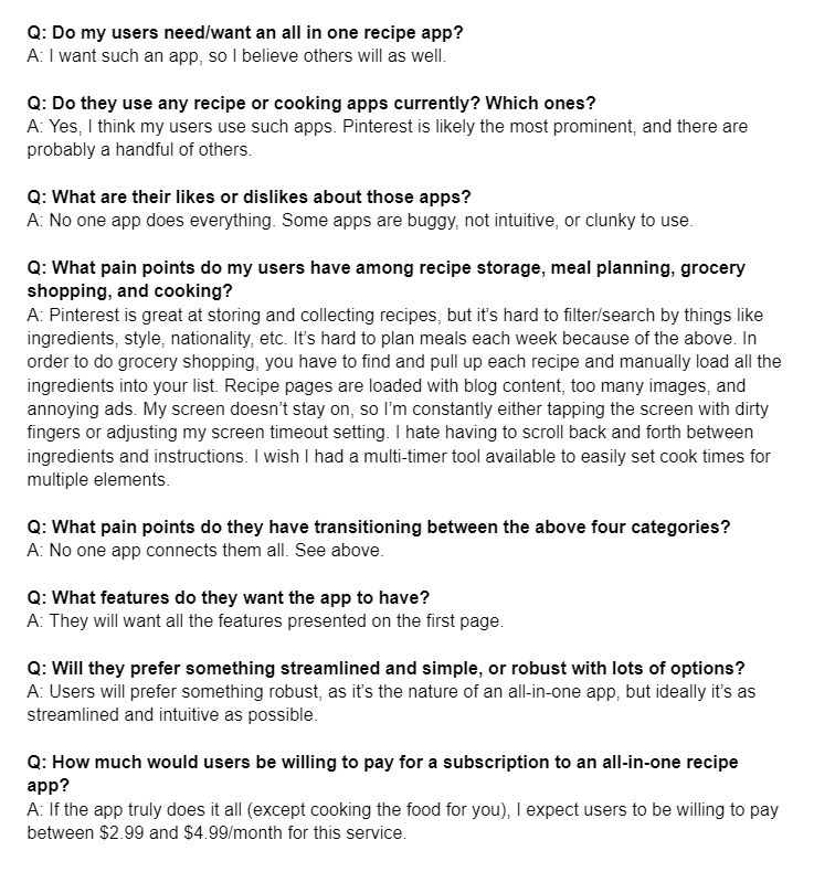
I came up with a list of questions about what this app could be, then wrote down my assumptions to answer those questions.
Validation: Cooking Speedbumps
I created an online survey and extended an open invitation through social media for people to respond. A total of 52 participants took the survey.
While my audience wants some different features than I do, they also struggle with many of the same pain points as me. The ability to import recipes, “only the recipe” view, keyword tagging, recipe organization, and meal planning are all features my audience craves.
Top Takeaways
54%
of participants struggle to collect and organize their recipes in one location.
50%
of participants have a hard time choosing meals and when to cook them.
40%
of participants wrestle with getting ingredients from recipes into their shopping list.
76%
of participants hate scrolling back and forth between ingredients and instructions within a recipe.
User Personas: Three Paths for Use
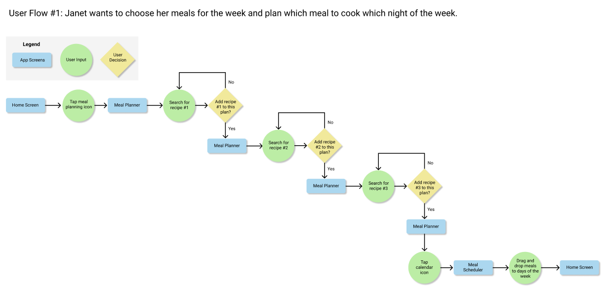
I developed three user personas based on my audience's needs, as well as a user flow for each persona.

Janet French

Flo Ackerman

Mark Jones
Janet is a 45-year-old nurse with 3 kids. She and her husband both work full time jobs and drive the kids to school and after-school activities, so she’s very busy. She loves cooking, but meal planning takes too much time. She wants a quick and easy way to plan meals each week; it should be easy to use, as she’s always on the go, and should automate as many processes for her as possible.
Flo is a 23-year-old social media influencer. She spends a lot of time on her online presence, which involves cooking different recipes. As a person with a physical disability, getting out to the store for ingredients is challenging. She needs a way to upload all the ingredients from her various dishes into a single list, then export that list into her favorite grocery shopping app.
Mark is a 28-year-old software engineer. As a minimalist, he likes to keep things as simple as possible. Cooking his own meals is one way to do that, but finds the overall process complicated and time-consuming. He wants to be able to pick recipes on the spot based on the ingredients he has on hand, and cook something quickly and easily.
Visual Direction: Keep it Simple
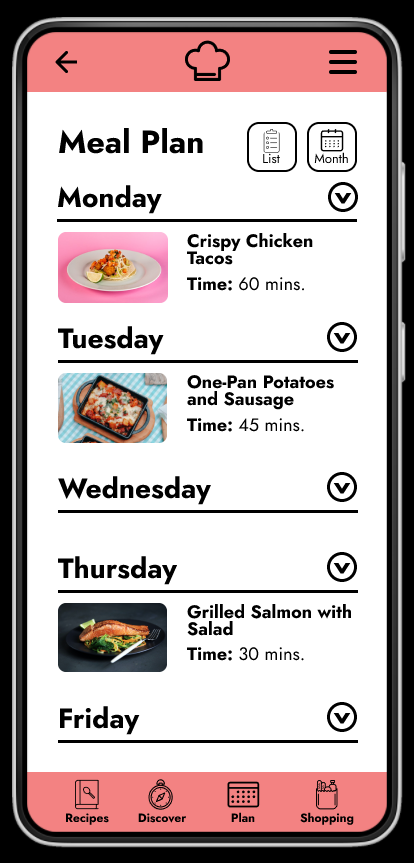
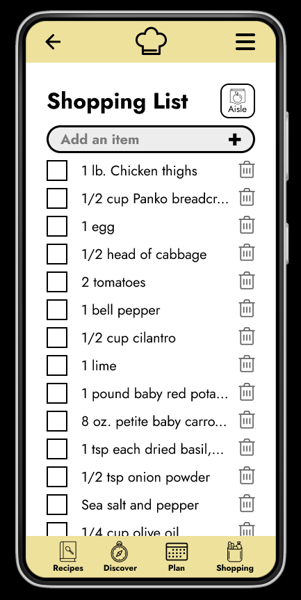
As a robust app, I knew I needed to keep every element of the design as simple as possible to help users navigate its features. I also knew that recipe photos would take up a lot of screen real estate on many of the pages. In addition, 58% of my audience uses Pinterest for recipe collecting, more than any other app.
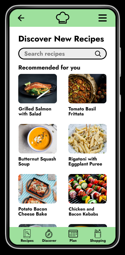
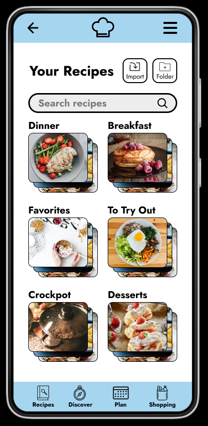
For these reasons, I chose a clean layout and minimalistic color palette to mimic Pinterest and keep navigation as intuitive as possible. I used a different color in the header and footer navigation for each of the four primary sections of the app to give a subtle, visual clue as to what section the user is currently in.
Wireframes: An Outline
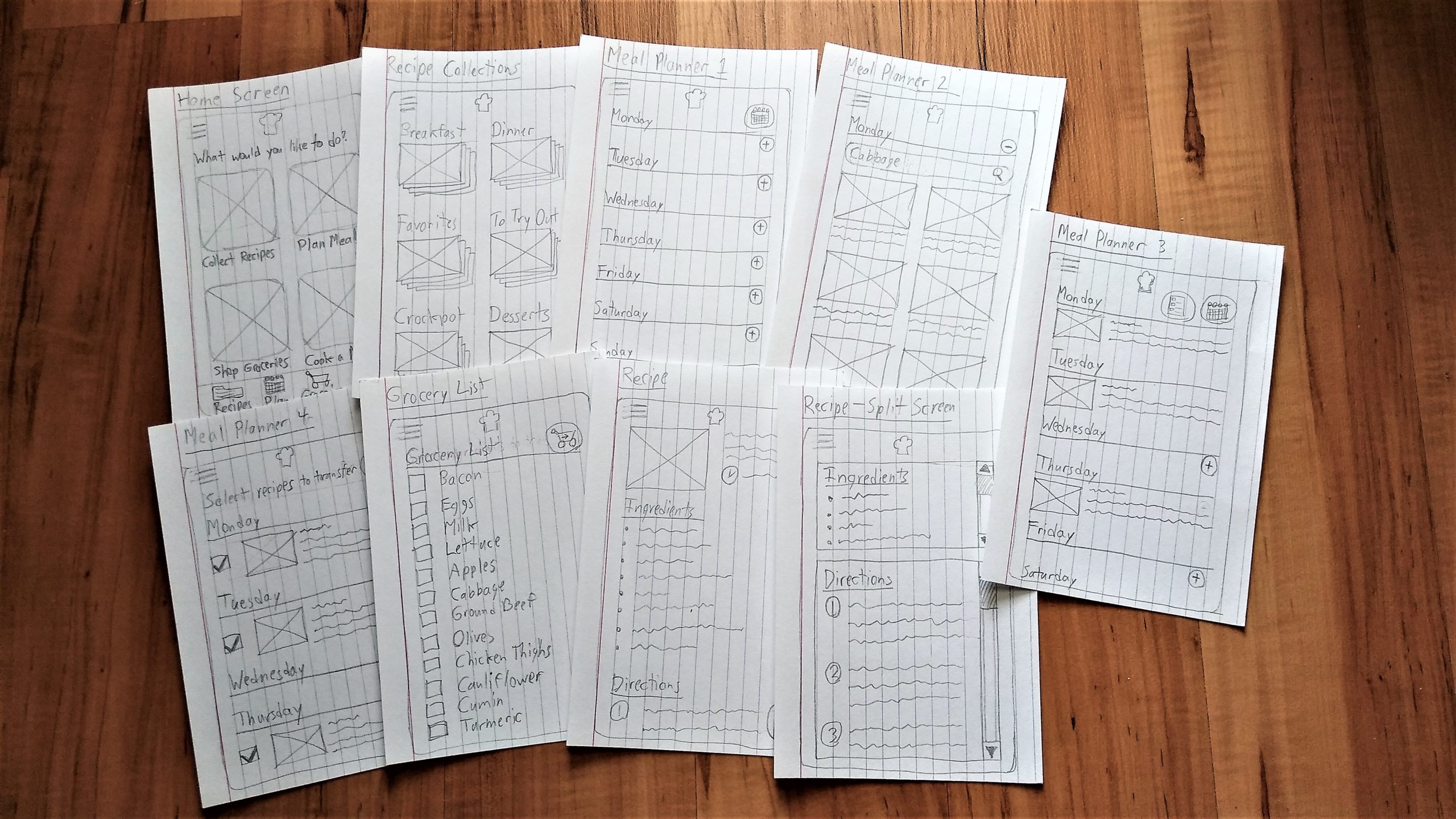
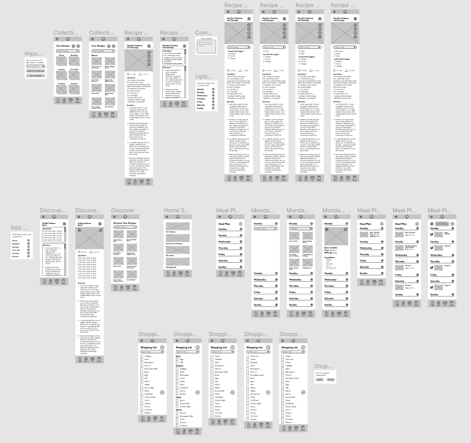
I proceeded with drawing paper wireframes, then turning them into digital wireframes in Figma.
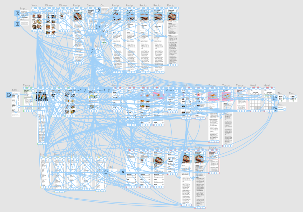
Prototype: Many Points of Interaction
I converted my wireframes into a digital, interactive prototype. Because I wanted the app to be so robust with so many features, this part of the process took longer than expected.
Usability Findings: User Challenges Lead to UI Improvements
For user testing, I conducted two rounds of unmoderated user testing through Lookback.io.
Round 1:
• Users often seemed confused or lost in the process
• The prototype programming threw them off once or twice
• There were unexpected issues with the prototype due to screen size
• The directions were not always clear enough
• Switching between Lookback and prototype was difficult.
Implementation:
I updated the design by adding additional search functionality, changing icons and their labels, adding “Success” messages to completed actions, and implementing an internal scroll window to the “Split Screen” mode of recipes. I updated the instructions to be more direct and use more precise language. I hope this will all help users in the future!
Round 2:
• Users still got lost, but more due to Lookback than the prototype
• Users commented on enjoying the cookbook scanner, split screen mode, timers, import feature, and grocery aisle view.
• Users mentioned pain points: Not showing quantities of groceries in grocery list; can you remove items from grocery list? “Add” and “Export” are used in two different places, which could confuse users; Are comments for self, or other users to see?
Implementation:
I added grocery quantities to the grocery list and “trash can” icons to each grocery list item. I changed one “Export” usage to “Transfer”. “Add” in two places still works, I think, because you can add from two different locations to two other locations; that crossover means the same word should be used. I also added a note to the comment feature that it’s “for the Sous Chef community.”
Final Product: Sous Chef
Outcomes: Many Lessons Learned
Over the course of this project:
• I originally set out to create an app that assisted with recipe organization, meal planning, grocery shopping, and cooking. Other features, like recipe discovery and importing from other apps, came through market research and user research.
• I reached the duration goal by rapidly conducting user research, creating the prototype, and testing with a limited number of participants.
• I learned that many other people struggle with similar parts of the recipe organization, planning, shopping, and cooking process as me.
• I was surprised to learn that certain features–like recipe discovery and keeping stock of what’s in your pantry–were more popular than I thought they would be, while other features–like split screen mode and a built-in timer–were not as popular as I expected.
• In the future, I would choose a project that is less ambitious; this app could have even more features that could not be added at this time.
• I would also spend a little more time on planning and wireframing to help focus the rest of the UI design process.
• Finally, I would try to find more participants for user testing, offering rewards if needed, to further refine the prototype before launch.
• Ultimately, despite some setbacks and speedbumps, I accomplished my goal of creating an all-in-one cooking app prototype within the deadline.
• In my user research, I wish I had asked participants which mobile OS they use. This would have helped guide the decision whether to develop the app for Android or Apple.
• I plan to launch a more basic version of the app with only the most essential features at first. This will allow me to get a real product out into the world quickly. Then, as I receive feedback from users, I can refine those features as well as add more features from this prototype over time.
